The Poisson Nature of War

The Poisson Nature of War

When we look back at history and explain why the world is the way it is, we rarely attribute specific causes and results to chance. We don’t say that a group of terrorists happened to choose to fly planes into the World Trade Center on 9/11. We don’t say that a new technology happened to come along to advance the economy. And we don’t say that a war between two countries happened to break out. But in some ways it would make more sense for us to look back at history and view events as chance contingencies. Steven Pinker argues that we should do this when we look back at history’s wars.
 
 
Specifically, when we take a statistical view of the history of war, we see that wars follow a Poisson distribution. When we record all the wars in human history we see lots of short intervals between wars and fewer long gaps between wars. When we look back at history and try to explain wars from a causal standpoint, we don’t look at the pauses and gaps between wars. We look instead at the triggering factors and buildup to war. But what the statistics argue is that we are often seeing causal patterns and narratives where none truly exist. Pinker writes, “the Poisson nature of war undermines historical narratives that see constellations in illusory clusters.”
 
 
We see one war as leading to another war. We see a large war as making people weary of fighting and death, ultimately leading to a large period of peace. We create narratives which explain the patterns we perceive, even if the patterns are not really there. Pinker continues,
 
 
“Statistical thinking, particularly an awareness of the cluster illusion, suggests that we are apt to exaggerate the narrative coherence of this history – to think that what did happen must have happened because of historical forces like cycles, crescendos, and collision courses.”
 
 
We don’t like to attribute history to chance events. We don’t like to attribute historical decisions to randomness. We like cohesive narratives that weave together multiple threads of history, even when examples of random individual choices or chance events shape the historical threads and narratives. Statistics shows us that the patterns we see are not always real, but that doesn’t stop us from trying to pull patterns out of the randomness or the Poisson distribution of history anyway.
Random Clusters

Random Clusters

The human mind is not good at randomness. The human mind is good at identifying and seeing patterns. The mind is so good at patter recognition and so bad at randomness that we will often perceive a pattern in a situation where no pattern exists. We have trouble accepting that statistics are messy and don’t always follow a set pattern that we can observe and understand.
 
 
Steven Pinker points this out in his book The Better Angels of Our Nature and I think it is an important point to keep in mind. He writes, “events that occur at random will seem to come in clusters, because it would take a nonrandom process to space them out.” This problem of our perception of randomness comes into play when our music streaming apps shuffle songs at random. If we have a large library of our favorite songs to chose from, some of those songs will be by the same artist. If we hear two or more songs from the artist back to back, we will assume there is some sort of problem with the random shuffling of the streaming service. We should expect to naturally get clusters of songs by the same artist or even off the same album, but it doesn’t feel random to us when it happens. To solve this problem, music streaming services deliberately add algorithms that stop songs from the same artist from appearing in clusters. This makes the shuffle less random overall, but makes the perception of the shuffle feel more random to us.
 
 
Pinker uses lightning to describe the process in more detail. “Lightning strikes are an example of what statisticians call a Poisson process,” he writes. “In a Poisson process, events occur continuously, randomly, and independently of one another. … in a Poisson process the intervals between events are distributed exponentially: there are lots of short intervals and fewer and fewer of them as they get longer and longer.”
 
 
To understand a Poisson process, we have to be able to understand having many independent events and we have to shift our perspective to look at the space between events as variables, not just look at the events themselves as variables. Both of these things are hard to do. It is hard to look at a basketball team and think that their next shot is independent of the previous shot (this is largely true). It is hard to look at customer complaints and see them as independent (also largely true), and it is hard to look at the history of human wars and think that events are also independent (Pinker shows this to be largely true as well). We tend to see events as connected even when they are not, a perspective error on our part. We also look just at the events, not at the time between the events. If we think that the time between the events will have a statistical dispersion that we can analyze, it shifts our focus away from the actual event itself. We can then think about what caused the pause and not what caused the even. This helps us see the independence between events and helps us see the statistics between both the event and the subsequent pause between the next event. Shifting our focus in this way can help us see Poisson distributions, random distributions with clusters, and patterns that we might miss or misinterpret. 
 
 
All of these factors are part of probability and statistics which our minds have trouble with. We like to see patterns and think causally. We don’t like to see larger complex perspective shifting statistics. We don’t like to think that there is a statistical probability without an easily distinguishable pattern that we can attribute to specific causal structures. However, as lightning and other Poisson processes show us, sometimes the statistical perspective is the better perspective to have, and sometimes our brains run amok with finding patterns that do not exist in random clusters.
Learning from Patterns in History

Learning from Patterns in History

It is not enough to simply know history. Knowing history simply fills your brain with a bunch of facts. If you want to do something useful with the history that you know, such as learn from it to inform your decision-making, then you have to understand that history. Learning from history and understanding history means making connections, discerning patterns, and generalizing to new situations.
 
 
Steven Pinker writes about this in his book The Better Angels of Our Nature:
 
 
“Traditional history is a narrative of the past. But if we are to heed George Santayana’s advisory to remember the past so as not to repeat it, we need to discern patterns in the past, so we can know what to generalize to the predicaments of the present.”
 
 
If we want to make decisions about how to govern ourselves, about what we can expect if global warming intensifies, and about our economy, then it is helpful to look at patterns, trends, and outlier events of the past and understand them. We have to use statistics, test hypothesis against the data, analyze causal structures, and attempt to fit current situations into context using historical precedent. None of this is easy, and the science isn’t always exact, but it does help us better understand both what came before us and where we are currently. Patterns are what we learn from, and identifying real patterns rather than fluctuating noise is a complex but useful process.
 
 
Without taking the time to look at the past through a lens of data and science we leave ourselves open to misunderstandings of history. We will identify patterns that don’t actually exist, we will fail to put our current moment in the appropriate context, and we will be guessing as to what we should do next. By examining history and teasing out the patterns through statistical analysis, we hope to be able to make better decisions based on true historical precedence. We may still get things wrong, we may not use a large enough data set (or may not have a large enough dataset), we may not be able to generalize from the historical data to our present moment, but at least we are thinking carefully about what to do based on what the data of the past tells us. History is a story on its own, but with science it is a series of patterns that we can examine to better understand what has happened in the past and what may be to come in the future.
When to Stop Counting

When to Stop Counting

Yesterday I wrote about the idea of scientific versus political numbers. Scientific numbers are those that we rely on for decision-making. They are not always better and more accurate numbers than political numbers, but they are generally based on some sort of standardized methodology and have a concrete and agreed upon backing to them. Political numbers are more or less guestimates or are formed from sources that are not confirmed to be reliable. While they can end up being more accurate than scientific figures they are harder to accept and justify in decision-making processes. In the end, the default is scientific numbers, but scientific numbers do have a flaw that keeps them from ever becoming what they proport to be. How do we know when it is time to stop counting and when we are ready to move forward with a scientific number rather than fall back on a political number?
Christopher Jencks explores this idea in his book The Homeless by looking at a survey conducted by Martha Burt at the Urban Institute. Jencks writes, “Burt’s survey provides quite a good picture of the visible homeless. It does not tell us much about those who avoid shelters, soup kitchens, and the company of other homeless individuals. I doubt that such people are numerous, but I can see no way of proving this. It is hard enough finding the proverbial needle in a haystack. It is far harder to prove that a haystack contains no more needles.” The quote shows that Burt’s survey was good at identifying the visibly homeless people, but that at some point in the survey a decision was made to stop attempting to count the less visibly homeless. It is entirely reasonable to stop counting at a certain point, as Jencks mentions it is hard to prove there are no more needles left to count, but that always means there will be a measure of uncertainty with your counting and results. Your numbers will always come with a margin of error because there is almost no way to be certain that you didn’t miss something.
Where we chose to stop counting can influence whether we should consider our numbers to be scientific numbers or political numbers. I would argue that the decision for where to stop our count is both a scientific and a political decision itself. We can make political decisions to stop counting in a way that deliberately excludes hard to count populations. Alternatively, we can continue our search to expand the count and change the end results of our search. Choosing how scientifically accurate to be with our count is still a political decision at some level.
However, choosing to stop counting can also be a rational and economic decision. We may have limited funding and resources for our counting, and be forced to stop at a reasonable point that allows us to make scientifically appropriate estimates about the remaining uncounted population. Diminishing marginal returns to our counting efforts also means at a certain point we are putting in far more effort into counting relative to the benefit of counting one more item for any given survey. This demonstrates how our numbers can be based on  scientific or political motivations, or both. These are all important considerations for us whether we are the counter or studying the results of the counting. Where we chose to stop matters, and because we likely can’t prove we have found every needle in the haystack, and that no more needles exist. No matter what, we will have to face the reality that the numbers we get are not perfect, no matter how scientific we try to make them.
Political and Scientific Numbers

Political and Scientific Numbers

I am currently reading a book about the beginnings of the Industrial Revolution and the author has recently been comparing the development of textile mills, steam engines, and chemical production in Britain in the 1800’s to the same developments on the European continent. It is clear that within Britain the developments of new technologies and the adoption of larger factories to produce more material was much quicker than on the continent, but exactly how much quicker is hard to determine. One of the biggest challenges is finding reliable and accurate information to compare the number of textile factories, the horse power of steam engines, or how many chemical products were exported in a given decade. In the 1850s getting good data and preserving that data for historians to sift through and analyze a couple of hundred years later was not an easy task. Many of the numbers that the author has referenced are generalized estimates and ranges, not well defined statistical figures. Nevertheless, this doesn’t mean the data are not useful and cannot help us understand general trends of the industrial revolution in Britain and the European continent.
Our ability to obtain and store numbers, information, and data is much better today than in the 1800s, but that doesn’t mean that all of our numbers are now perfect and that we have everything figured out. Sometimes our data comes from pretty reliable sources, like the GPS map data on Strava that gives us an idea of where lots of people like to exercise and where very few people exercise. Other data is pulled from surveys which can be unreliable or influenced by word choice and response order. Some data comes from observational studies that might be flawed in one way or another. Other data may just be incomplete, from small sample sizes, or simply messy and hard to understand. Getting good information out of such data is almost impossible. As the saying goes, garbage in – garbage out.
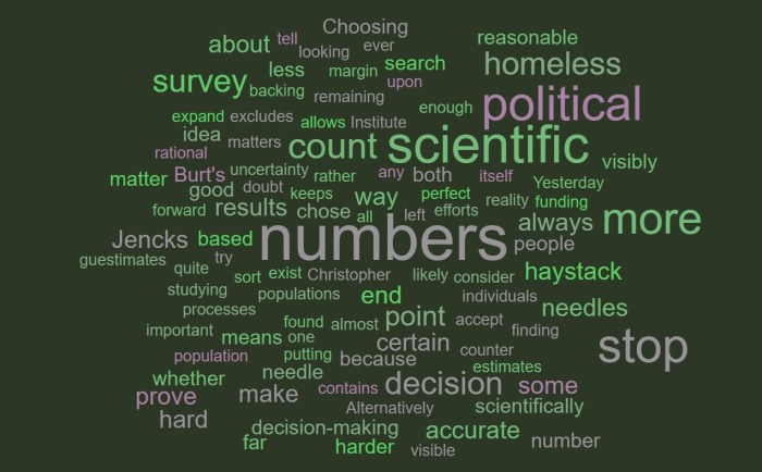
Consequently we end up with political numbers and scientific numbers. Christopher Jencks wrote about the role that both have played in how we understand and think about homelessness in his book The Homeless. He writes, “one needs to distinguish between scientific and political numbers. This distinction has nothing to do with accuracy. Scientific numbers are often wrong, and political numbers are often right. But scientific numbers are accompanied by enough documentation so you can tell who counted what, whereas political numbers are not.”
It is interesting to think about the accuracy (or perhaps inaccuracy) of the numbers we use to understand our world. Jencks explains that censuses of homeless individuals need to be conducted early in the morning or late at night to capture the full number of people sleeping in parks or leaving from/returning to overnight shelters. He also notes the difficulty of contacting people to confirm their homeless status and the challenges of simply surveying people by asking if they have a home. People use different definitions of having a home, being homeless, or having a fixed address and those differences can influence the count of how many homeless people live within a city or state. The numbers are backed by a scientific process, but they may be inaccurate and not representative of reality. By contrast, political numbers could be based on a random advocate’s average count of meals provided at a homeless shelter or by other estimates. These estimates may end up being just as accurate, or more so, than the scientific numbers used, but how the numbers are used and understood can be very different.
Advocacy groups, politicians, and concerned citizens can use non-scientific numbers to advance their cause or their point of view. They can rely on general estimates to demonstrate that something is or is not a problem. But they can’t necessarily drive actual action by governments, charities, or private organizations with only political numbers. Decisions look bad when made based on rough guesses and estimates. They look much better when they are backed by scientific numbers, even if those numbers are flawed. When it is time to actually vote, when policies have to be written and enacted, and when a check needs to be signed, having some sort of scientific backing to a number is crucial for self-defense and for (at least an attempt at) rational thinking.
Today we are a long way off from the pen and paper (quill and scroll?) days of the 1800s. We have the ability to collect far more data than we could have ever imagined, but the numbers we end up with are not always that much better than rough estimates and guesses. We may use the data in a way that shows that we trust the science and numbers, but the information may ultimately be useless. These are some of the frustrations that so many people have today with the ways we talk about politics and policy. Political numbers may suggest we live in one reality, but scientific numbers may suggest another reality. Figuring out which is correct and which we should trust is almost impossible, and the end result is confusion and frustration. We probably solve this with time, but it will be a hard problem that will hang around and worsen as misinformation spreads online.
Poverty - $2.00 A Day - Kathryn Edin & H. Luke Shaefer

Who Experiences Deep Poverty

The image of deep poverty in the United States is unfairly and inaccurately racialized. For many people, it is hard to avoid associating words like poverty, ghetto, or poor with black and minority individuals and communities. For many, the default mental image for such terms is unavoidably non-white, and white poverty ends up taking on qualifiers to distinguish it as something separate from the default image for poverty. We use white-trash or something related to a trailer park to distinguish white poverty as something different than general poverty which is coded as black and minority.
This distinction, default, and mental image of poverty being a black and minority problem creates a lot of misconceptions about who is truly poor in America. In the book $2.00 A Day Kathryn Edin and H. Luke Shaefer write, “the phenomenon of $2-a-day poverty among households with children [has] been on the rise since the nation’s landmark welfare reform legislation was passed in 1996. … although the rate of growth [is] highest among African Americans and Hispanics, nearly half of the $2-a-day poor [are] white.” (Tense changed from past to present by blog author)
Poverty, in public discourse and public policy, is often presented as a racial problem because we do not recognize how many white people in the United States live in poverty. The quote above shows that the racialized elements of our general view of poverty do reflect real differences in changing rates of poverty among minority groups, but also reveals that almost half – nearly a majority – of people in poverty are white.
The consequence is that policy and public opinion often approaches poverty from a race based standpoint, and not from an economic and class based standpoint. Policy is not well designed when it doesn’t reflect the reality of the situation, and public discourse is misplaced when it fails to accurately address the problems society faces. Biases, prejudices, and discriminatory practices can be propped up and supported when we misunderstand the nature of reality, especially when it comes to extreme poverty. Additionally, by branding only minorities as poor and carving out a special space for white poverty, we reducing the scope and seriousness of the problem, insisting that it is a cultural problem of inferior and deficient groups, rather than a by-product of an economic system or a manifestation of shortcomings of economic and social models. It is important that we recognize that poverty is not something exclusive to black and minority groups.
Data Mining is a First Step

Data Mining is a First Step

From big tech companies, sci-fi movies, and policy entrepreneurs data mining is presented as a solution to many of our problems. With traffic apps collecting mountains of movement data, governments collecting vast amounts of tax data, and heath-tech companies collecting data for every step we take, the promise of data mining is that our sci-fi fantasies will be realized here on earth in the coming years. However, data mining is only a first step on a long road to the development of real knowledge that will make our world a better place. The data alone is interesting and our computing power to work with big data is astounding, but data mining can’t give us answers, only interesting correlations and statistics.
In The Book of Why Judea Pearl writes:
“It’s easy to understand why some people would see data mining as the finish rather than the first step. It promises a solution using available technology. It saves us, as well as future machines, the work of having to consider and articulate substantive assumptions about how the world operates. In some fields our knowledge may be in such an embryonic state that we have no clue how to begin drawing a model of the world. But big data will not solve this problem. The most important part of the answer must come from such a model, whether sketched by us or hypothesized and fine-tuned by machines.”
Big data can give us insights and help us identify unexpected correlations and associations, but identifying unexpected correlations and associations doesn’t actually tell us what is causing the observations we make. The messaging of massive data mining is that we will suddenly understand the world and make it a better place. The reality is that we have to develop hypotheses about how the world works based on causal understandings of the interactions between various factors of reality. This is crucial or we won’t be able to take meaningful action based what comes from our data mining. Without developing causal hypotheses we cannot experiment with associations and continue to learn, we can only observe what correlations come from big data. Using the vast amounts of data we are collecting is important, but we have to have a goal to work toward and a causal hypothesis of how we can reach that goal in order for data mining to be meaningful.
Stories from Bid Data

Stories from Big Data

Dictionary.com describes datum (the singular of data) as “a single piece of information; any fact assumed to be a matter of direct observation.” So when we think about big data, we are thinking about massive amounts of individual pieces of information or individual facts from direct observation. Data simply are what they are, facts and individual observations in isolation.
On the other hand Dictionary.com defines information as “knowledge communicated or received concerning a particular fact or circumstance.” Information is the knowledge, story, and ideas we have about the data. These two definitions are important for thinking about big data. We never talk about big information, but the reality is that big data is less important than the knowledge we generate from the data, and that isn’t as objective as the individual datum.
In The Book of Why Judea Pearl writes, “a generation ago, a marine biologist might have spent months doing a census of his or her favorite species. Now the same biologist has immediate access online to millions of data points on fish, eggs, stomach contents, or anything else he or she wants. Instead of just doing a census, the biologist can tell a story.” Science has become contentious and polarizing recently, and part of the reason has to do with the stories that we are generating based on the big data we are collecting. We can see new patterns, new associations, new correlations, and new trends in data from across the globe. As we have collected this information, our impact on the planet, our understanding of reality, and how we think about ourselves in the universe has changed. Science is not simply facts, that is to say it is not just data. Science is information, it is knowledge and stories that have continued to challenge the narratives we have held onto as a species for thousands of years.
Judea Pearl thinks it is important to recognize the story aspect of big data. He thinks it is crucial that we understand the difference between data and information, because without doing so we turn to the data blindly and can generate an inaccurate story based on what we see. He writes,
“In certain circles there is an almost religious faith that we can find the answers to … questions in the data itself, if only we are sufficiently clever at data mining. However, readers of this book will know that this hype is likely to be misguided. The questions I have just asked are all causal, and causal questions can never be answered from data alone.”
Big data presents us with huge numbers of observations and facts, but those facts alone don’t represent causal structures or deeper interactions within reality. We have to generate information from the data and combine that new knowledge with existing knowledge and causal hypothesis to truly learn something new from big data. If we don’t then we will simply be identifying meaningless correlations without truly understanding what they mean or imply.
Data Driven Methods

Data Driven Methods

In the world of big data scientists today have a real opportunity to push the limits scientific inquiry in ways that were never before possible. We have the collection methods and computing power available to analyze huge datasets and make observations in minutes that would have taken decades just a few years ago. However, many areas of science are not being strategic with this new power. Instead, many areas of science simply seem to be plugging variables into huge data sets and haphazardly looking for correlations and associations. Judea Pearl is critical of this approach to science in The Book of Why and uses the Genome-wide association study (GWAS) to demonstrate the shortcomings of this approach.
 
 
Pearl writes, “It is important to notice the word association in the term GWAS. This method does not prove causality; it only identifies genes associated with a certain disease in the given sample. It is a data-driven rather than hypothesis-driven method, and this presents problems for causal inference.”
 
 
In the 1950s and 1960s, Pearl explains, R. A. Fisher was skeptical that smoking caused cancer and argued that the correlation between smoking and cancer could have simply been the result of a hidden variable. He suggested it was possible for a gene to exist that both predisposed people to smoke and predisposed people to develop lung cancer. Pearl writes that such a smoking gene was indeed discovered in 2008 through the GWAS, but Pearl also notes that the existence of such a gene doesn’t actually provide us with any causal mechanism between people’s genes and smoking behavior or cancer development.  The smoking gene was not discovered by a hypothesis driven method but rather by data driven methods. Researchers simply looked at massive genomic datasets to see if any genes correlated between people who smoke and people who develop lung cancer. The smoking gene stood out in that study.
 
 
Pearl continues to say that causal investigations have shown that the gene in question is important for nicotine receptors  in lung cells, positing a causal pathway to smoking predispositions and the gene. However, causal studies also indicate that the gene increases your chance of developing lung cancer by less than doubling the chance of cancer. “This is serious business, no doubt, but it does not compare to the danger you face if you are a regular smoker,” writes Pearl. Smoking is associated with a 10 times increase in the risk of developing lung cancer, while the smoking gene only accounts for a less than double risk increase. The GWAS tells us that the gene is involved in cancer, but we can’t make any causal conclusions from just an association. We have to go deeper to understand its causality and to relate that to other factors that we can study. This helps us contextualize the information from the GWAS.
 
 
Much of science is still like the GWAS, looking for associations and hoping to be able to identify a causal pathway as was done with the smoking gene. In some cases these data driven methods can pay off by pointing the way for researchers to start looking for hypothesis driven methods, but we should recognize that data driven methods themselves don’t answer our questions and only represent correlations, not underlying causal structures. This is important because studies and findings based on just associations can be misleading. Discovering a smoking gene and not explaining the actual causal relationship or impact could harm people’s health, especially if they decided that they would surely develop cancer because they had the gene. Association studies ultimately can be misleading, misused, misunderstood, and dangerous, and that is part of why Pearl suggests a need to move beyond simple association studies. 

Mediating Variables

Mediating Variables

Mediating variables stand in the middle of the actions and the outcomes that we can observe. They are often tied together and hard to separate from the action and the outcome, making their direct impact hard to pull apart from other factors. They play an important role in determining causal structures, and ultimately in shaping discourse and public policy about good and bad actions.
Judea Pearl writes about mediating variables in The Book of Why. He uses cigarette smoking, tar, and lung cancer as an example of the confounding nature of mediating variables. He writes, “if smoking causes lung cancer only through the formation of tar deposits, then we could eliminate the excess cancer risk by giving smokers tar-free cigarettes, such as e-cigarettes. On the other hand, if smoking causes cancer directly or through a different mediator, then e-cigarettes might not solve the problem.”
The mediator problem of tar still has not been fully disentangled and fully understood, but it is an excellent example of the importance, challenges, and public health consequences of mediating variables. Mediators can contribute directly to the final outcome we observe (lung cancer), but they may not be the only variable at play. In this instance, other aspects of smoking may directly cause lung cancer. An experiment between cigarette and e-cigarette smokers can help us get closer, but we won’t be able to say there isn’t a self-selection effect between traditional and e-cigarette smokers that plays into cancer development. However, closely studying both groups will help us start to better understand the direct role of tar in the causal chain.
Mediating variables like this pop up when we talk about the effectiveness of schools, the role for democratic norms, and the pros or cons of traditional gender roles. Often, mediating variables are driving the concerns we have for larger actions and behaviors. We want all children to go to school, but argue about the many mediating variables within the educational environment that may or may not directly contribute to specific outcomes that we want to see. It is hard to say which specific piece is the most important, because there are so many mediating variables all contributing directly or possibly indirectly to the education outcomes we see and imagine.