A Sense of Danger

A Sense of Danger

2020 was a unique year in many senses, and one worrying change in 2020 was an increase in violence that seems to be continuing through 2021. Crime rates have been falling across the United States since a peak in the 1990s, until a reversal in the trend in 2020. We have not yet seen whether it is an anomaly related to the COVID-19 Pandemic that will dissipate, or whether it reflects a new trajectory of violence that we need to be concerned about. Nevertheless, crime has recently been on an uptick after a long decline.
People may currently be aware of an increase in crime, but that likely doesn’t mean that the increase in crime feels new to them. Despite the recent falling crime rates, people’s general perception of crime is that it had been increasing before 2020. The perception of increasing crime did not match the continual drop in crime, at least not until 2020. Part of the misperception seems to come from the constant news reporting of crime and better measures of crime by police and the FBI. Christopher Jencks wrote about this in his book The Homeless, “police have spent billions of dollars computerizing their record keeping systems, so crimes that get reported are more likely to become part of the office record. Improved reporting and record-keeping plus highly selective news reporting have, in turn, helped convince the public that their neighborhoods are more dangerous.”
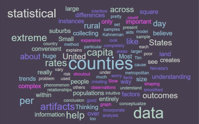
Having good information, data, and statistics for crime is a good thing. It is important that we have a good and accurate sense of how much crime and violence is taking place in our cities, who is committing the crime, and who tends to be the victims. However, new data reporting and collecting abilities can make it seem like there is more crime than there used to be, simply because we can better collect and report that information. Better collecting and reporting means that news stations can run more stories about crimes that previously would have gone unreported, increasing the prevalence of crime in the news, building the sense of danger that people feel. With broader news reporting and an online news system driven by clicks, we also see more crime that takes place outside our communities, even when browsing local news websites.
This can ultimately have negative effects for society. While it is good to have accurate information, that information can be misleading and misused. Increasing people’s sense of danger for political ends can erode social trust and lead to profiling and dangerous policing policies that have racial disparities. It can lead to disinvestment in areas that people deem dangerous and can limit the interactions that people are willing to have in their communities, furthering disinvestment and reinforcing a sense of danger. Context is the key and is easy to leave out when reporting crime and discussing individual crimes within larger trends. Our recent uptick in crime against a background of misperception could be especially dangerous, with extreme reactions against increases in crimes that may end up being driven by the peculiar circumstances of the Pandemic. We should work to make our cities and communities safer, but we should also work to make sure people have an accurate perception of the safety or danger of their communities.
Political and Scientific Numbers

Political and Scientific Numbers

I am currently reading a book about the beginnings of the Industrial Revolution and the author has recently been comparing the development of textile mills, steam engines, and chemical production in Britain in the 1800’s to the same developments on the European continent. It is clear that within Britain the developments of new technologies and the adoption of larger factories to produce more material was much quicker than on the continent, but exactly how much quicker is hard to determine. One of the biggest challenges is finding reliable and accurate information to compare the number of textile factories, the horse power of steam engines, or how many chemical products were exported in a given decade. In the 1850s getting good data and preserving that data for historians to sift through and analyze a couple of hundred years later was not an easy task. Many of the numbers that the author has referenced are generalized estimates and ranges, not well defined statistical figures. Nevertheless, this doesn’t mean the data are not useful and cannot help us understand general trends of the industrial revolution in Britain and the European continent.
Our ability to obtain and store numbers, information, and data is much better today than in the 1800s, but that doesn’t mean that all of our numbers are now perfect and that we have everything figured out. Sometimes our data comes from pretty reliable sources, like the GPS map data on Strava that gives us an idea of where lots of people like to exercise and where very few people exercise. Other data is pulled from surveys which can be unreliable or influenced by word choice and response order. Some data comes from observational studies that might be flawed in one way or another. Other data may just be incomplete, from small sample sizes, or simply messy and hard to understand. Getting good information out of such data is almost impossible. As the saying goes, garbage in – garbage out.
Consequently we end up with political numbers and scientific numbers. Christopher Jencks wrote about the role that both have played in how we understand and think about homelessness in his book The Homeless. He writes, “one needs to distinguish between scientific and political numbers. This distinction has nothing to do with accuracy. Scientific numbers are often wrong, and political numbers are often right. But scientific numbers are accompanied by enough documentation so you can tell who counted what, whereas political numbers are not.”
It is interesting to think about the accuracy (or perhaps inaccuracy) of the numbers we use to understand our world. Jencks explains that censuses of homeless individuals need to be conducted early in the morning or late at night to capture the full number of people sleeping in parks or leaving from/returning to overnight shelters. He also notes the difficulty of contacting people to confirm their homeless status and the challenges of simply surveying people by asking if they have a home. People use different definitions of having a home, being homeless, or having a fixed address and those differences can influence the count of how many homeless people live within a city or state. The numbers are backed by a scientific process, but they may be inaccurate and not representative of reality. By contrast, political numbers could be based on a random advocate’s average count of meals provided at a homeless shelter or by other estimates. These estimates may end up being just as accurate, or more so, than the scientific numbers used, but how the numbers are used and understood can be very different.
Advocacy groups, politicians, and concerned citizens can use non-scientific numbers to advance their cause or their point of view. They can rely on general estimates to demonstrate that something is or is not a problem. But they can’t necessarily drive actual action by governments, charities, or private organizations with only political numbers. Decisions look bad when made based on rough guesses and estimates. They look much better when they are backed by scientific numbers, even if those numbers are flawed. When it is time to actually vote, when policies have to be written and enacted, and when a check needs to be signed, having some sort of scientific backing to a number is crucial for self-defense and for (at least an attempt at) rational thinking.
Today we are a long way off from the pen and paper (quill and scroll?) days of the 1800s. We have the ability to collect far more data than we could have ever imagined, but the numbers we end up with are not always that much better than rough estimates and guesses. We may use the data in a way that shows that we trust the science and numbers, but the information may ultimately be useless. These are some of the frustrations that so many people have today with the ways we talk about politics and policy. Political numbers may suggest we live in one reality, but scientific numbers may suggest another reality. Figuring out which is correct and which we should trust is almost impossible, and the end result is confusion and frustration. We probably solve this with time, but it will be a hard problem that will hang around and worsen as misinformation spreads online.
Data Mining is a First Step

Data Mining is a First Step

From big tech companies, sci-fi movies, and policy entrepreneurs data mining is presented as a solution to many of our problems. With traffic apps collecting mountains of movement data, governments collecting vast amounts of tax data, and heath-tech companies collecting data for every step we take, the promise of data mining is that our sci-fi fantasies will be realized here on earth in the coming years. However, data mining is only a first step on a long road to the development of real knowledge that will make our world a better place. The data alone is interesting and our computing power to work with big data is astounding, but data mining can’t give us answers, only interesting correlations and statistics.
In The Book of Why Judea Pearl writes:
“It’s easy to understand why some people would see data mining as the finish rather than the first step. It promises a solution using available technology. It saves us, as well as future machines, the work of having to consider and articulate substantive assumptions about how the world operates. In some fields our knowledge may be in such an embryonic state that we have no clue how to begin drawing a model of the world. But big data will not solve this problem. The most important part of the answer must come from such a model, whether sketched by us or hypothesized and fine-tuned by machines.”
Big data can give us insights and help us identify unexpected correlations and associations, but identifying unexpected correlations and associations doesn’t actually tell us what is causing the observations we make. The messaging of massive data mining is that we will suddenly understand the world and make it a better place. The reality is that we have to develop hypotheses about how the world works based on causal understandings of the interactions between various factors of reality. This is crucial or we won’t be able to take meaningful action based what comes from our data mining. Without developing causal hypotheses we cannot experiment with associations and continue to learn, we can only observe what correlations come from big data. Using the vast amounts of data we are collecting is important, but we have to have a goal to work toward and a causal hypothesis of how we can reach that goal in order for data mining to be meaningful.
Stories from Bid Data

Stories from Big Data

Dictionary.com describes datum (the singular of data) as “a single piece of information; any fact assumed to be a matter of direct observation.” So when we think about big data, we are thinking about massive amounts of individual pieces of information or individual facts from direct observation. Data simply are what they are, facts and individual observations in isolation.
On the other hand Dictionary.com defines information as “knowledge communicated or received concerning a particular fact or circumstance.” Information is the knowledge, story, and ideas we have about the data. These two definitions are important for thinking about big data. We never talk about big information, but the reality is that big data is less important than the knowledge we generate from the data, and that isn’t as objective as the individual datum.
In The Book of Why Judea Pearl writes, “a generation ago, a marine biologist might have spent months doing a census of his or her favorite species. Now the same biologist has immediate access online to millions of data points on fish, eggs, stomach contents, or anything else he or she wants. Instead of just doing a census, the biologist can tell a story.” Science has become contentious and polarizing recently, and part of the reason has to do with the stories that we are generating based on the big data we are collecting. We can see new patterns, new associations, new correlations, and new trends in data from across the globe. As we have collected this information, our impact on the planet, our understanding of reality, and how we think about ourselves in the universe has changed. Science is not simply facts, that is to say it is not just data. Science is information, it is knowledge and stories that have continued to challenge the narratives we have held onto as a species for thousands of years.
Judea Pearl thinks it is important to recognize the story aspect of big data. He thinks it is crucial that we understand the difference between data and information, because without doing so we turn to the data blindly and can generate an inaccurate story based on what we see. He writes,
“In certain circles there is an almost religious faith that we can find the answers to … questions in the data itself, if only we are sufficiently clever at data mining. However, readers of this book will know that this hype is likely to be misguided. The questions I have just asked are all causal, and causal questions can never be answered from data alone.”
Big data presents us with huge numbers of observations and facts, but those facts alone don’t represent causal structures or deeper interactions within reality. We have to generate information from the data and combine that new knowledge with existing knowledge and causal hypothesis to truly learn something new from big data. If we don’t then we will simply be identifying meaningless correlations without truly understanding what they mean or imply.
Regression Coefficients

Regression Coefficients

Statistical regression is a great thing. We can generate a scatter plot, generate a line of best fit, and measure how well that line describes the relationship between the individual points within the data. The better the line fits (the more that individual points stick close to the line) the better the line describes the relationships and trends in our data. However, this doesn’t mean that the regression coefficients tell us anything about causality. It is tempting to say that a causal relationship exists when we see a trend line with lots of tight fitting dots around and two different variables on an X and Y axis, but this can be misleading.
In The Book of Why Judea Pearl writes, “Regression coefficients, whether adjusted or not, are only statistical trends, conveying no causal information in themselves.” It is easy to forget this, even if you have had a statistics class and know that correlation does not imply causation. Humans are pattern recognition machines, but we go a step beyond simply recognizing a pattern, we instantly set about trying to understand what is causing the pattern. However, our regression coefficients and scatter plots don’t always hold clear causal information. Quite often there is a third hidden variable that cannot be measured directly that is influencing the relationship we discover in our regression coefficients.
Pearl continues, “sometimes a regression coefficient represents a causal effect, and sometimes it does not – and you can’t rely on the data alone to tell you the difference.” Imagine a graph with a regression line running through a plot of force applied by a hydraulic press and fracture rates for ceramic mugs. One axis may be pressure, and the other axis may be thickness of the ceramic mug. The individual points represent the point at which individual mugs fractured We would be able to generate a regression line by testing the fracture strength of mugs of different thickness, and from this line we would be able to develop pretty solid causal inferences about thickness and fracture rates. A clear causal link could be identified by the regression coefficients in this scenario.
However, we could also imagine a graph that plotted murder rates in European cities and the spread of Christianity. With one axis being the number of years a city has had a Catholic bishop and the other axis being the number of murders, we may find that murders decrease the longer a city has had a bishop.  From this, we might be tempted to say that Christianity (particularly the location of a Bishop in a town) reduces murder. But what would we point to as the causal mechanism? Would it be religious beliefs adopted by people interacting with the church? Would it be that marriage rules that limited polygamy ensured more men found wives and became less murderous as a result? Would it be that some divinity smiled upon the praying people and made them to be less murderous? A regression like the one I described above wouldn’t tell us anything about the causal mechanism in effect in this instance. Our causal-thinking minds, however, would still generate causal hypothesis, some of which would be reasonable but others less so (this example comes from the wonderful The WEIRDest People in the World by Joseph Henrich).
Regression coefficients can be helpful, but they are less helpful when we cannot understand the causal mechanisms at play. Understanding the causal mechanisms can help us better understand the relationship represented by the regression coefficients, but the coefficient itself only represents a relationship, not a causal structure. Approaching data and looking for trends doesn’t help us generate useful information. We must first have a sense of a potential causal mechanism, then examine the data to see if our proposed causal mechanism has support or not. This is how we can use data and find support for causal hypothesis within regression coefficients.
The Screening-Off Effect

The Screening-Off Effect

Sometimes to our great benefit, and sometimes to our detriment, humans like to put things into categories – at least Western, Educated, Industrialized, Rich, Democratic (WEIRD) people do. We break things into component parts and categorize each part as belonging to a category of thing. We do this with things like planets, animals, and players within sports. We like established categories and dislike when our categorization changes. This ability has greatly helped us in science and strategic planning, allowing our species to do incredible things and learn crucial lessons about the world. What is remarkable about this ability is how natural and easy it is for us, but how hard it is to explain or program into a machine.
One component of this remarkable ability is referred to as the screening-off effect by Judea Pearl in The Book of Why. Pearl writes, “how do we decide which information to disregard, when every new piece of information changes the boundary between the relevant and the irrelevant? For humans, this understanding comes naturally. Even three-year-old toddlers understand the screening-off effect, though they don’t have a name for it. … But machines do not have this instinct, which is one reason that we equip them with causal diagrams.”
From a young age we know what information is the most important and what information we can ignore. We intuitively have a good sense for when we should seek out more information and when we have enough to make a decision (although sometimes we don’t follow this intuitive sense). We know there is always more information out there, but don’t have time to seek out every piece of information possible. Luckily, the screening-off effect helps us know when to stop and makes decision-making possible for us.
Beyond knowing when to stop, the screening-off effect helps us know when to ignore irrelevant information. The price of tea in China isn’t a relevant factor for us when deciding what time to wake up the next morning. We recognize that there are no meaningful causal pathways between the price of tea and the best time for us to wake up. This causal insight, however, doesn’t exist for machines that are only programmed with the specific statistics we build into them. We specifically have to code a causal pathway that doesn’t include the price of tea in China for a machine to know that it can ignore that information. The screening-off effect, Pearl explains, is part of what allows humans to think causally. In cutting edge science there are many factors we wouldn’t think to screen out that may impact the results of scientific experiments, but for the most part, we know what can be ignored and can look at the world around us through a causal lens because we know what is and is not important.
Causal Hypotheses

Causal Hypotheses

In The Book of Why Judea Pearl argues that humans have a unique superpower among animals and living creatures on earth. We are great at developing causal hypotheses. Animals are able to make observations about the world and some are even able to use tools to open fruit, find insects, and perform other tasks. However, humans alone seem to be able to take a tool, develop a hypothesis for why a tool works, and imagine what could be done to improve its functioning. This step requires that we develop causal hypotheses about the nature and reality of tools and how they interact with the objects we wish to manipulate. This is a hugely consequential mental ability, and one that humans have developed the ability to improve overtime, especially through cultural learning.
Our minds are imaginative and can think about potential future states. We can understand how our tools work and imagine ways in which our tools might be better in order for us to better achieve our goals. This is how we build causal hypotheses about the world, and how we go about exploring the world in search of evidence that confirms or overturns our imagined causal structures.
In the book, Pearl writes, “although we don’t need to know every causal relation between the variables of interest and might be able to draw some conclusions with only partial information, Wright makes one point with absolute clarity: you cannot draw causal conclusions without some causal hypothesis.”  (Sewall Wright is who Pearl references)
To answer causal questions we need to develop a causal hypothesis. We don’t need to have every bit of data possible, and we don’t need to perfectly intuit or know every causal structure, but we can still understand causality by investigating imagined causal pathways. Our brains are powerful enough to draw conclusions based on observed data and imagined causal pathways. While we might be wrong and have historically made huge errors in our causal attributions about the world, in many instances, we are great causal thinkers, to the point where causal structures that we identify are common sense. We might not know exactly what is happening at the molecular level, but we can understand the causal pathway between sharpening a piece of obsidian to form a point that could penetrate the flesh of an animal we are hunting. While some causal pathways are nearly invisible to us, a great deal are ready for us to view, and we should not forget that. We can get bogged down in statistics and become overly reliant on correlations and statistical relationships if we ignore the fact that our minds are adept at identifying and imagining causal structures.
Hope in Big Data

Hope in Big Data

Most of us probably don’t work with huge data sets, but all of us contribute to huge data sets. We know the world of big data is out there, and we know people are working with big data, but there are not many of us who truly know what it means and how we should think about any of it. In The Book of Why, Judea Pearl argues that even many of those doing research and running companies based on big data don’t fully understand what it all means.
Pearl is critical of researchers and entrepreneurs who lack causal understandings but pursue new knowledge and information by pulling correlations and statistics out of large data sets. There are some companies that are taking advantage of the fact that huge amounts of computing power can give us insights into data sets that we never before could have generated, however, these insights are not always as meaningful as we are lead to believe.
Pearl writes, “The hope – and at present, it is usually a silent one – is that the data themselves will guide us to the right answers whenever causal questions come up.”
My last post was about the overuse of the phrase: correlation is not causation. Finding correlations and relationships in data is meaningless if we don’t also have causal understandings in mind. This is the critique that Pearl makes with the quote above. If we don’t have a way of understanding basic causal structures, then the phrase is right, correlations don’t mean anything. Many companies and researchers are in a stage where they are finding correlations and unexpected statistical results in big data, but they lack causal understandings to do anything meaningful with the data. In the world of public policy this feels like the saying, a solution in search of a problem or in the world of healthcare like a pay and chase scenario.
Pearl argues throughout the book that we are better at identifying causal structures than we are lead to believe in our statistics courses. He also argues that understanding causality is key to unlocking the potential of big data and actually getting something useful out of massive datasets. Without a grounding in causality, we are wasting our time with the statistical research we do. We are running around with solutions in the forms of big data correlations that don’t have a causal underpinning. It is as if we are paying fraudulent claims, then chasing down some of the money we spent and congratulating ourselves on preventing fraud. The end result is a poor use of data that we prop up as a magnanimous solution.
Correlation and Causation - Judea Pearl - The Book of Why - Joe Abittan

Correlation and Causation

I have an XKCD comic taped to the door of my office. The comic is about the mantra of statistics, that correlation is not causation. I taped the comic to my office door because I loved learning statistics in graduate school and thinking deeply about associations and how mere correlations cannot be used to demonstrate that one thing causes another. Two events can correlate, but have nothing to do with each other, and a third thing may influence both, causing them to correlate without any causal link between the two things.
But Judea Pearl thinks that science and researchers have fallen into a trap laid out by statisticians and the infinitely repeated correlation does not imply causation mantra. Regarding this perspective of statistics he writes, “it tells us that correlation is not causation, but it does not tell us what causation is.”
Pearl seems to suggest in The Book of Why that there was a time where there was too much data, too much humans didn’t know, and too many people ready to offer incomplete assessments based on anecdote and incomplete information. From this time sprouted the idea that correlation does not imply causation. We started to see that statistics could describe relationships and that statistics could be used to pull apart entangled causal webs, identifying each individual component and assessing its contribution to a given outcome. However, as his quote shows, this approach never actually answered what causation is. It never actually told us when we can know and ascertain that a causal structure and causal mechanism is in place.
“Over and over again,” writes Pearl, “in science and in business, we see situations where mere data aren’t enough.”
To demonstrate the shortcomings of our high regard for statistics and our mantra that correlation is not causation, Pearl walks us through the congressional testimonies and trials of big tobacco companies in the United States. The data told us there was a correlation between smoking and lung cancer. There was overwhelming statistical evidence that smoking was related or associated with lung cancer, but we couldn’t attain 100% certainty just through statistics that smoking caused lung cancer. The companies themselves muddied the water with misleading studies and cherry picked results. They hid behind a veil that said that correlation was not causation, and hid behind the confusion around causation that statistics could never fully clarify.
Failing to develop a real sense of causation, failing to move beyond big data, and failing to get beyond statistical correlations can have real harms. We need to be able to recognize causation, even without relying on randomized controlled trials, and we need to be able to make decisions to save lives. The lesson of the comic taped to my door is helpful when we are trying to be scientific and accurate in our thinking, but it can also lead us astray when we fail to trust a causal structure that we can see, but can’t definitively prove via statistics.
Statistical Artifacts

Statistical Artifacts

When we have good graphs and statistical aids, thinking statistically can feel straightforward and intuitive. Clear charts can help us tell a story, can help us visualize trends and relationships, and can help us better conceptualize risk and probability. However, understanding data is hard, especially if the way that data is collected creates statistical artifacts.


Yesterday’s post was about extreme outcomes, and how it is the smallest counties in the United States where we see both the highest per capita instances of cancer and the lowest per capita instances of cancer. Small populations allow for large fluctuations in per capita cancer diagnoses, and thus extreme outcomes in cancer rates. We could graph the per capita rates, model them on a map of the United States, or present the data in unique ways, but all we would really be doing is creating a visual aid influenced by statistical artifacts from the samples we used. As Daniel Kahneman explains in his book Thinking Fast and Slow, “the differences between dense and rural counties do not really count as facts: they are what scientists call artifacts, observations that are produced entirely by some aspect of the method of research – in this case, by differences in sample size.”


Counties in the United States vary dramatically. Some counties are geographically huge, while others are pretty small – Nevada’s is a large state with over 110,000 square miles of land but only 17 counties compared to West Virginia with under 25,000 square feet of land and 55 counties. Across the US, some counties are exclusively within metropolitan areas, some are completely within suburbs, some are entirely rural with only a few hundred people, and some manage to incorporate major metros, expansive suburbs, and vast rural stretches (shoutout to Clark County, NV). They are convenient for collecting data, but can cause problems when analyzing population trends across the country. The variations in size and other factors creates the possibility for the extreme outcomes we see in things like cancer rates across counties. When smoothed out over larger populations, the disparities in cancer rates disappears.


Most of us are not collecting lots of important data for analysis each day. Most of us probably don’t have to worry too  much on a day to day basis about some important statistical sampling problem. But we should at least be aware of how complex information is, and how difficult it can be to display and share information in an accurate manner. We should turn to people like Tim Harford for help interpreting and understanding complex statistics when we can, and we should try to look for factors that might interfere with a convenient conclusion before we simply believe what we would like to believe about a set of data. Statistical artifacts can play a huge role in shaping the way we understand a particular phenomenon, and we shouldn’t jump to extreme conclusions based on poor data.